Case 03 · 2021 - present (first version designed February to July 2021; continuous evolution up to version 1.7)
The app that outgrew the showroom
A mobile app for Icon Selections, a creator of new flower varieties
Client: Icon Selections (client). I first designed the app in 2021 as an independent product designer.
- Product design
- UX
- UI
- Research
Video
- Business challenge
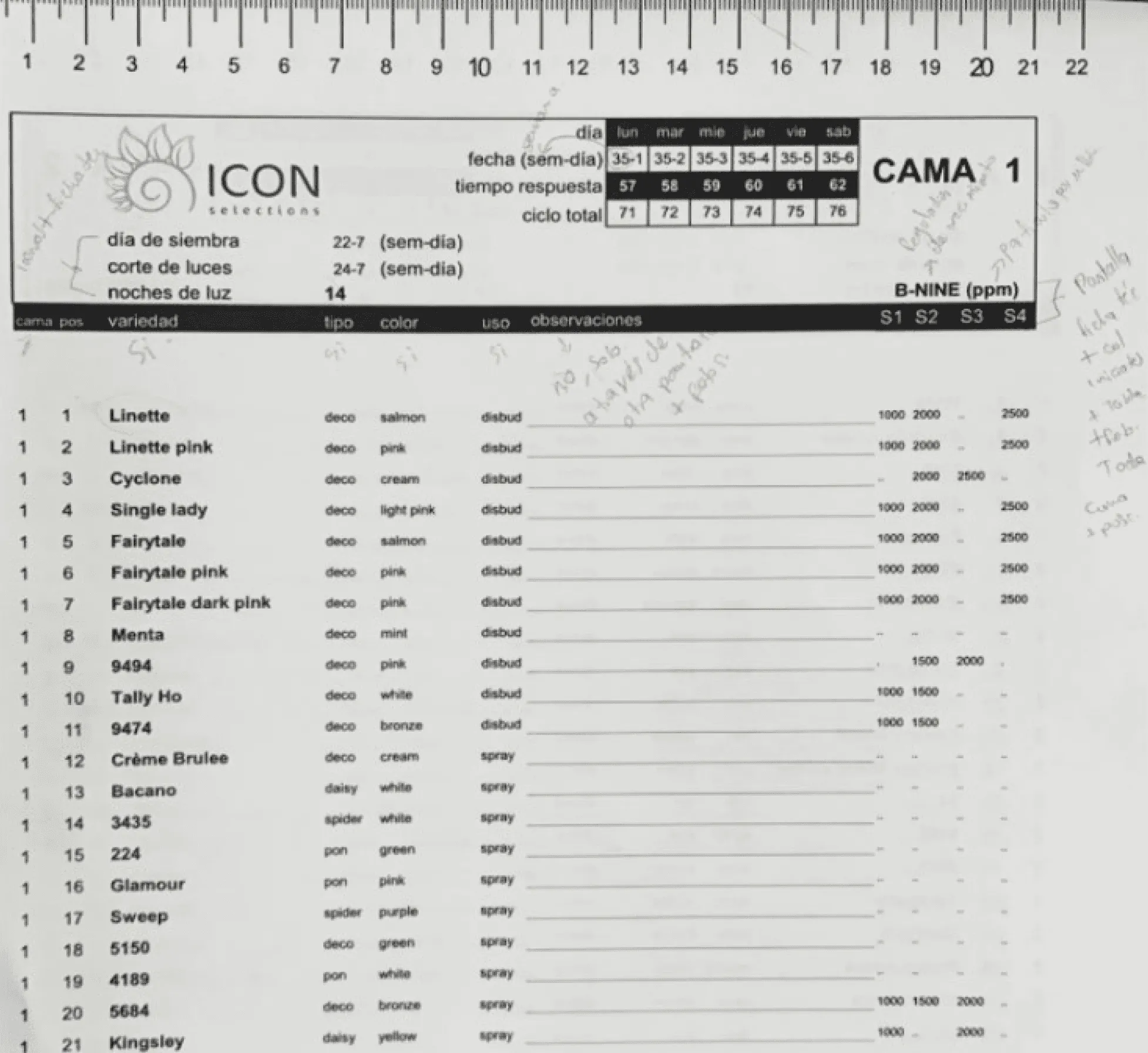
- Every year Icon Selections shows its new flower varieties in an outdoor showroom. Attendees recorded orders and feedback in a printed legal-size booklet that got lost or damaged, so data was lost and the rest had to be typed again by hand.
- My contribution
- I researched on site, designed the first version end to end (flows, UI foundations, components, prototype) and have owned the product's design through eight versions, 1.0 to 1.7. An event tool became a year-round catalog and a source of feedback for the business.
- Key result
- About 300 attendees use it at every showroom since 2021 and it captures about 70 orders a year (both figures from Icon Selections' own data, official source). Attendee feedback now becomes data the business analyses for each variety.
Business challenge
Icon Selections creates new flower varieties. Every year it hosts a showroom where flower supply chain stakeholders see them among the planted beds. Icon collects attendee feedback on the new varieties, and many orders are placed.
Attendees recorded all of that in a printed booklet. The goal was to digitize everything about the new varieties during the event: orders, most liked varieties, comments and photos.
This was harder than it sounds:
- The event is outdoors. People walk between flower beds, often with one free hand.
- The legal-size booklet was awkward for attendees and for the company.
- Paper gets lost or damaged, which means lost data.
- Digitizing the booklet afterwards took a lot of re-processing.
Role and contribution
Product design
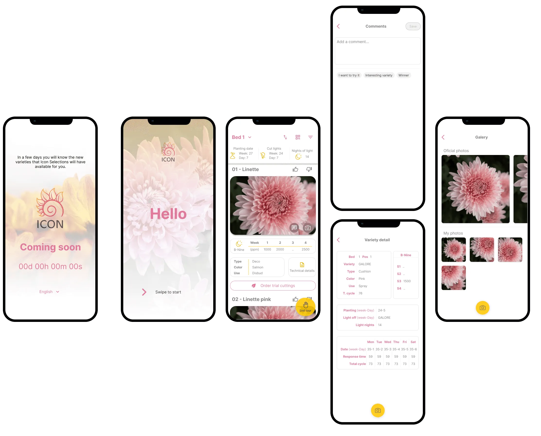
With the client, I defined the scope and features: a QR code per variety, filters by variety type and plant details, a single “Order Trial Cuttings” action, and a year-round digital catalog for the commercial team. I have kept shaping the roadmap through version 1.7.
UX
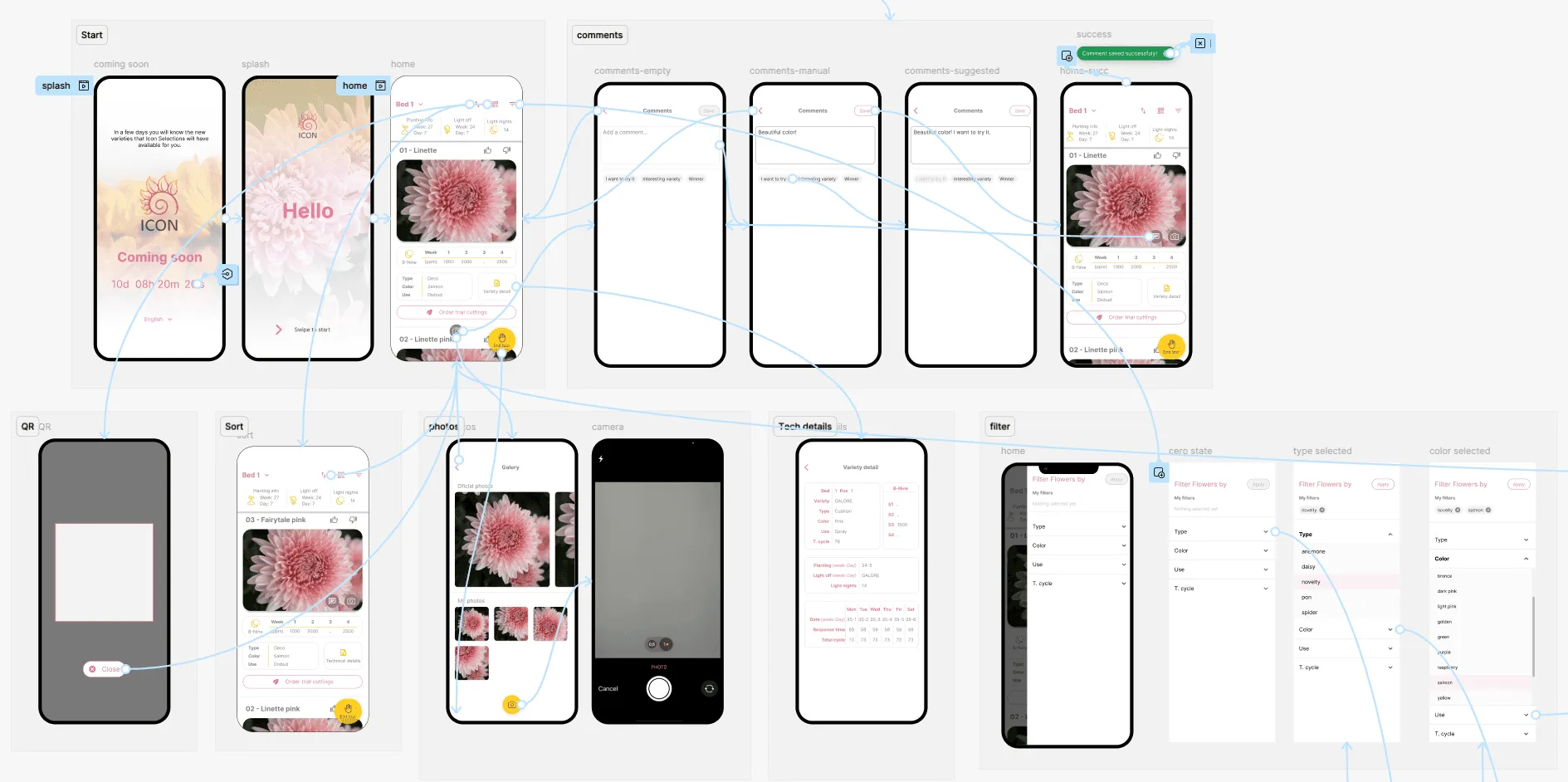
I restructured all the booklet content to follow the physical tour, bed by bed. That improves readability and decision-making. I designed the main flows: start, home by bed, comments, photos and camera, QR, sort, filter, technical details and end tour.
UI
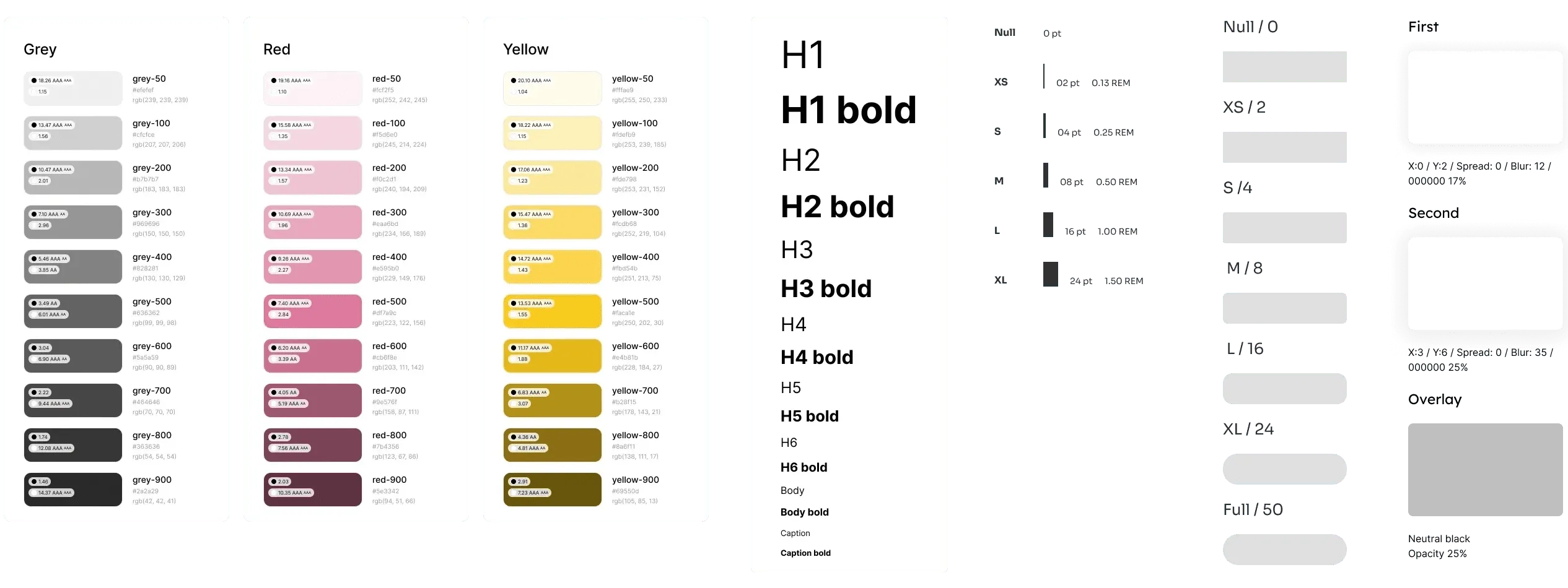
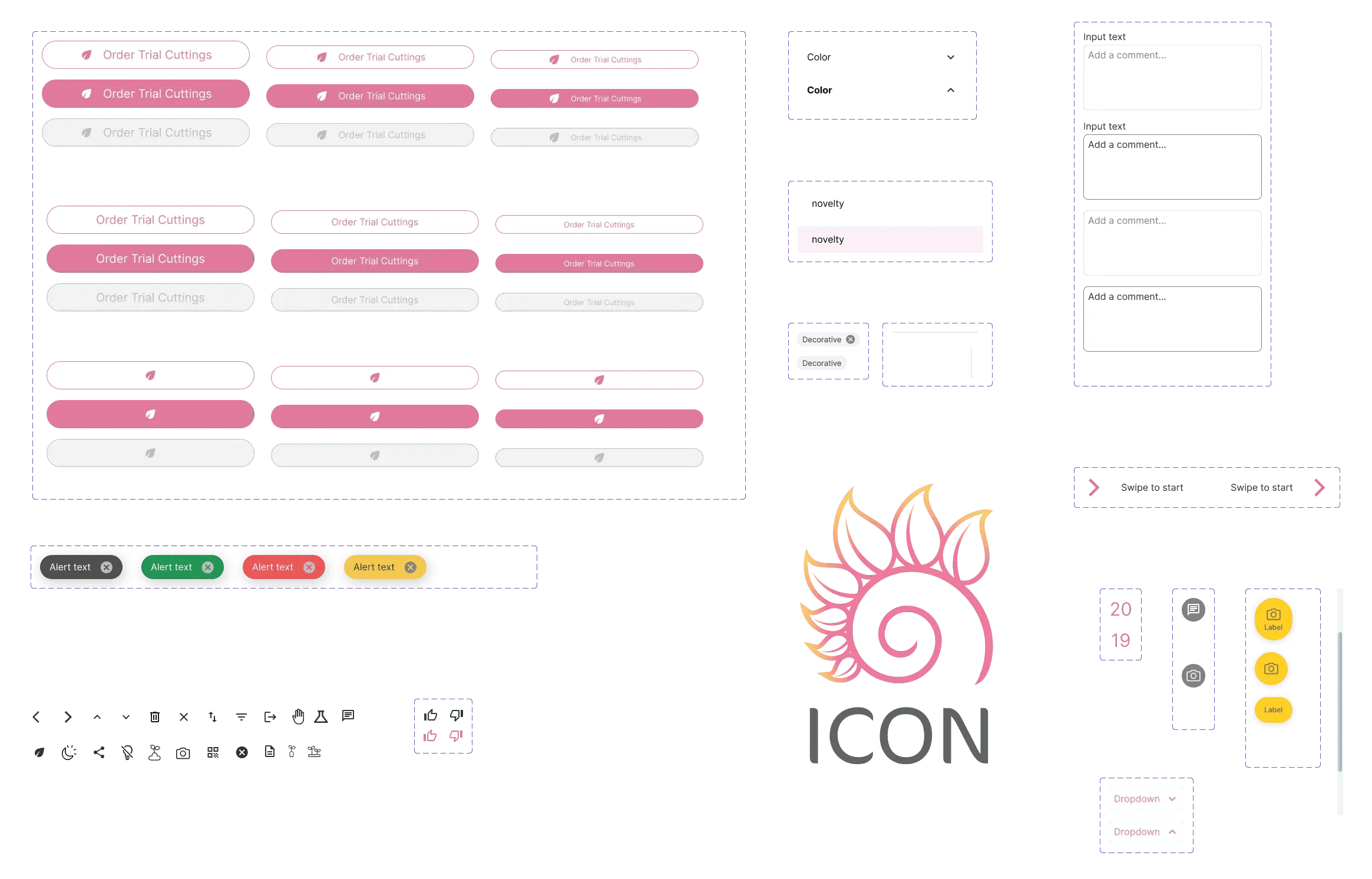
I defined the foundations (color, typography, spacing, shadows) and designed the components: Order Trial Cuttings buttons, dropdowns, chips, alerts, inputs, icons and a floating camera button. I iterated in high fidelity with the client’s feedback.
Research
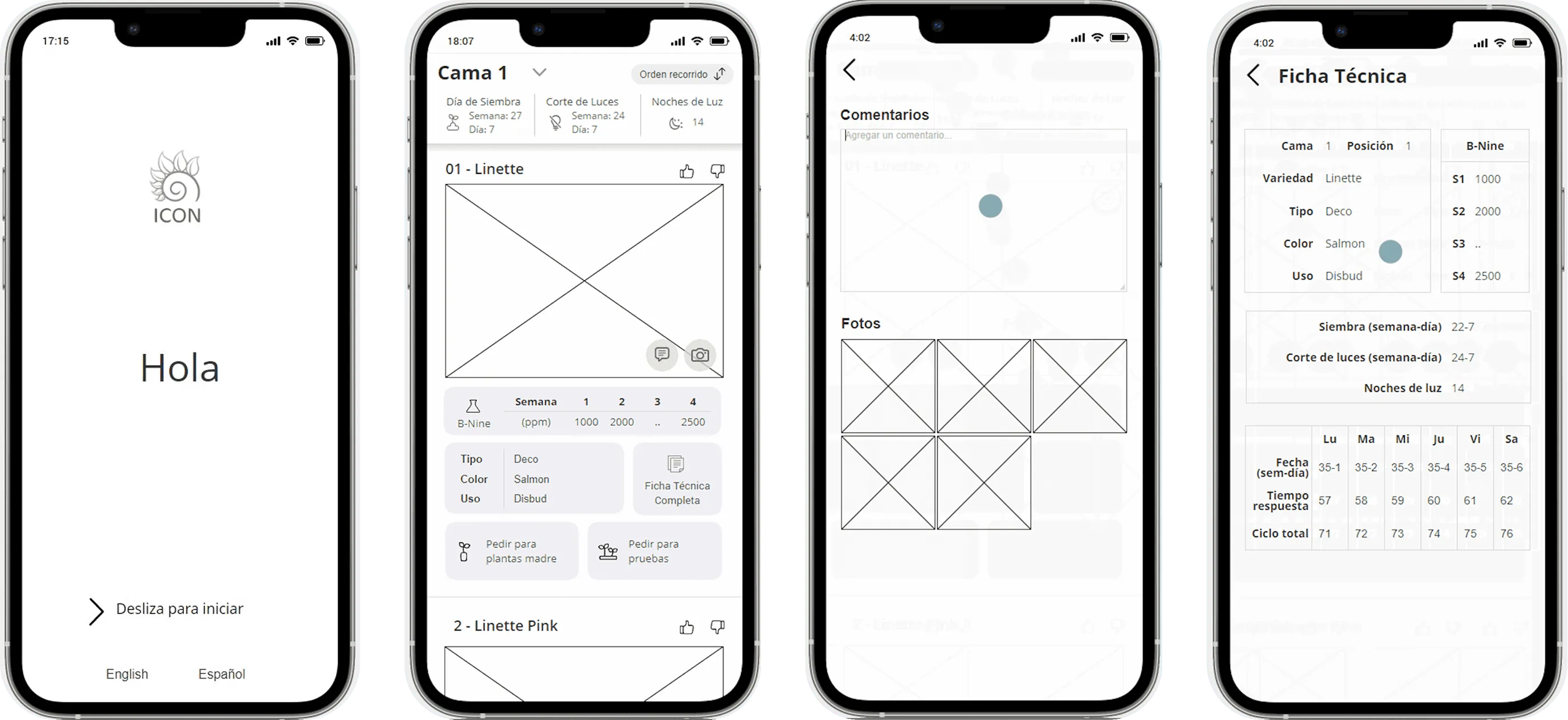
I ran structured interviews with the client at the venue where the event happens. I analysed the booklet used at previous events. I validated the mid-fidelity proposal with the client and with users.
Continuous evolution (1.0 to 1.7)
This is what makes the case relevant today. I did not deliver a project in 2021 and leave. I have owned the product’s design for five years, across eight versions.
- Version 1.7 added “Show varieties codes”.
- Planting attributes were added to the variety information.
- I developed a QR code search, requested by the client after seeing how the interaction worked in earlier showrooms.
- Seeing the real interaction at the showroom was key to adjusting the components so the flow stays coherent with the visit.
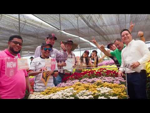
The 2022 showroom video on this page shows that real use: attendees using the app among the flower beds.
Approach
User-centered and iterative:
- Interviews and a site visit.
- Booklet analysis.
- Mid-fidelity proposal.
- Client feedback.
- Foundations and components.
- High fidelity.
- Final prototype.
- Observation at the live event.
- New versions.
Tools and how they were used
- Figma: mid-fidelity wireframes, UI foundations, the component library, high-fidelity screens and the final prototype.
- FigJam and Miro: booklet analysis, interview synthesis and flow mapping.
- Illustrator: icons and graphic assets.
Key decisions
-
Organize by bed, not by catalog. I chose a home organized bed by bed, following the physical tour, over a catalog organized by variety type like the commercial one. Attendees walk the showroom bed by bed, and the site visit showed that the app has to match what they see in front of them. The cost: catalog-style browsing needed its own filters by variety type and plant details, which I added after the client’s feedback.
-
A QR code per variety, not search. I chose scanning a QR code at each variety to open its detail, over typing or searching variety names. Outdoors, standing and with one hand, scanning is faster and avoids misspelled names. The cost: the client has to print and place a QR code at every variety for each event.
-
One order action, not per-option ordering. I chose a single “Order Trial Cuttings” button over several order options per variety. The client asked for one clear action, and attendees decide quickly during the event. The cost: order details such as quantities and options are settled later by the commercial team.
-
Suggested tags plus free text for comments. I chose quick suggested tags with an optional manual comment over free text only, as in the booklet. Tapping a tag is faster outdoors and produces data that can be counted per variety. The cost: less nuance when users only tap tags.
Edge cases and states
- Comments: empty, manual, suggested and success states.
- End tour: easier to reach after client feedback, so attendees can close their visit from anywhere.
- Camera and photos: attached to a variety.
- Sort and filter: each with its own states.
- Poor signal in the field: the app caches its content and handles weak connections well.
- QR codes: only codes from the current year are accepted. Earlier ones expire.
Challenges
Designing for the field. Sunlight, walking, one free hand and a long tour between beds. The answer was a clear interface that works in high-brightness conditions. That meant tuning the UI so it stays coherent and keeps a good design line.
Client feedback reshaped the flow. After the mid-fidelity proposal, the client’s feedback led to:
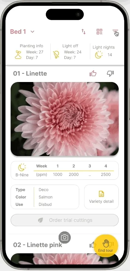
- an easier “End tour”,
- updated icons,
- a single “Order Trial Cuttings” button,
- filters by variety type and plant details,
- the QR button.
Result and impact
- About 300 attendees use the app at every showroom since 2021. Source: Icon Selections’ own data (official source).
- About 70 orders a year are captured through the app. Source: Icon Selections’ own data (official source).
- Real use is documented in the video of the 2022 showroom: attendees using the app among the flower beds.
- Orders and their tracking are real. The commercial team also uses the app all year as a digital catalog.
- Attendee feedback collected in the app is used to analyse what attendees think of each variety.
- There is no paper booklet, so no lost pages and no re-typing after the event.
How my experience made the difference
- Visiting the outdoor venue led to decisions a standard solution would have missed: a structure that follows the physical tour, a QR code per variety, filters for catalog use and a single order button.
- Staying with the product for five years turned an event tool into a catalog and a source of feedback data.
What I learned
Understanding the real interaction on site was essential. The components had to be adjusted so the flow stays coherent with the physical visit.
Tools
- Figma
- FigJam
- Miro
- Illustrator