Case 02 · 2024 (Crayon UI 1.0.1)
One team, one visual language: the system behind 18 modules
A design system for Connect EMR, built as component creator and Product Owner
Client: ABA Tech, the technology company of the ABA Centers of America holding. Crayon serves the whole Connect EMR suite. My role: Senior UX/UI Designer.
- Product design
- UI
- Research
- Business challenge
- Connect EMR was built from a small UI kit based on MUI. With few components to draw from, four UX/UI designers and each module drifted into their own visual styles, and front-end rebuilt the same pieces by hand.
- My contribution
- I created Crayon as component creator and Product Owner. I set the backlog from an internal audit of component usage, ran the joint sessions with development, and introduced a Visual QA practice so what ships matches what was designed.
- Key result
- Crayon was implemented in a total of 18 Connect EMR modules, and Visual QA on those modules moved from checking font sizes and border radius to reviewing flows and use cases.
Business challenge
Connect EMR screens were built from a UI kit based on MUI, the library the product started with. The kit had few components.
With four UX/UI designers working on different modules, screens and modules took on different visual styles. Components were iterated in different ways, and basic GUI elements were implemented differently from one module to the next.
The cost was twofold. The product felt like several products, and front-end carried manual effort to rebuild and adjust the same elements again and again.
Role and contribution
I was the component creator and the Product Owner of Crayon. I worked as Senior UX/UI Designer at ABA Tech.
Product design
As Product Owner I prioritized components and iterations and documented the component development roadmap. I agreed versions with development, for example 1.0.1, and led the joint sessions with the development team.
I also decided which requests did not become components (see key decision 4).
Research
I ran an internal UX audit of the system to measure which components appeared most on screen. That audit defined the backlog: buttons, inputs, checkboxes and cards first, then tabs, accordions and the stepper.
UI
I created the components. They include:
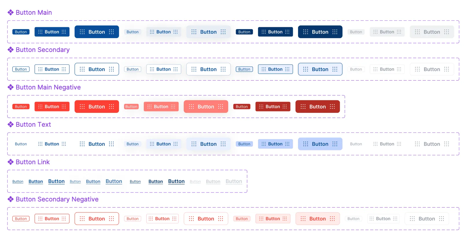
- Buttons: main, secondary, main negative, text, link and secondary negative, in three sizes and several states.
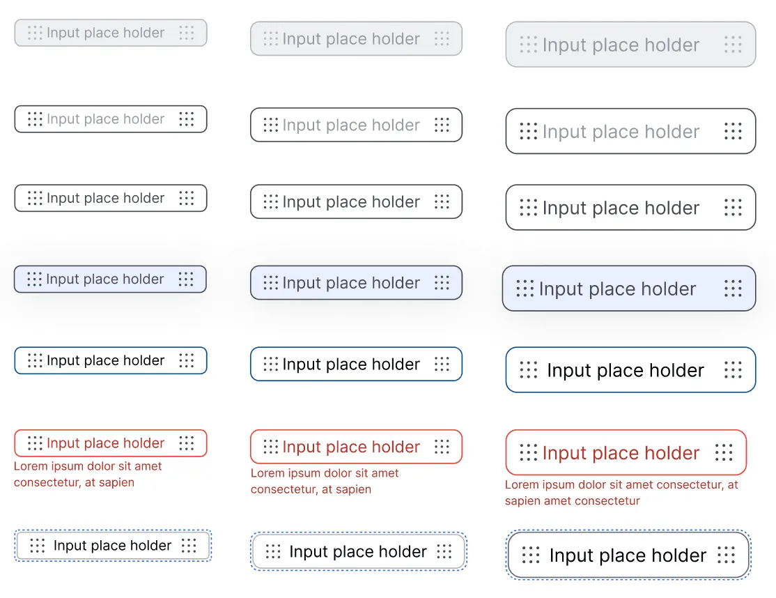
- Text inputs: disabled, default, filled, hover, active, error and focus.
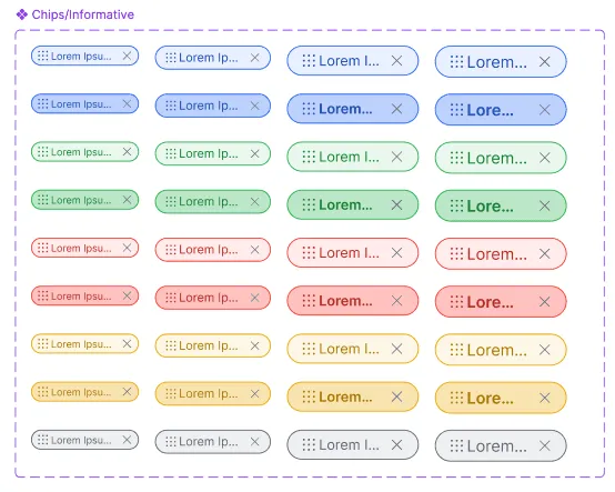
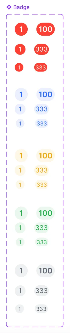
- Informative chips and numeric badges.
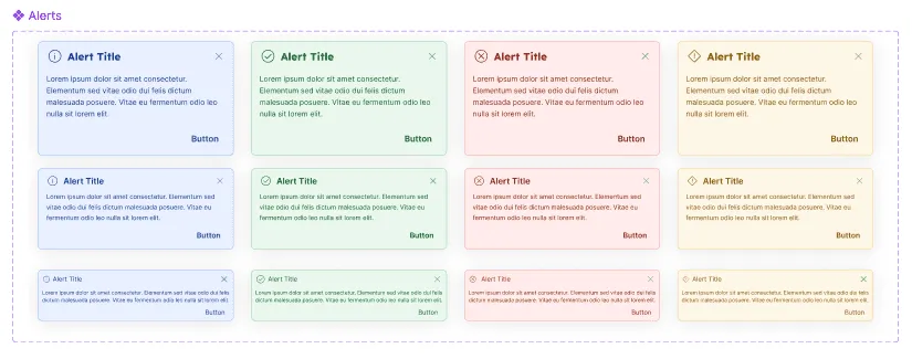
- Alerts: info, success, error and warning.
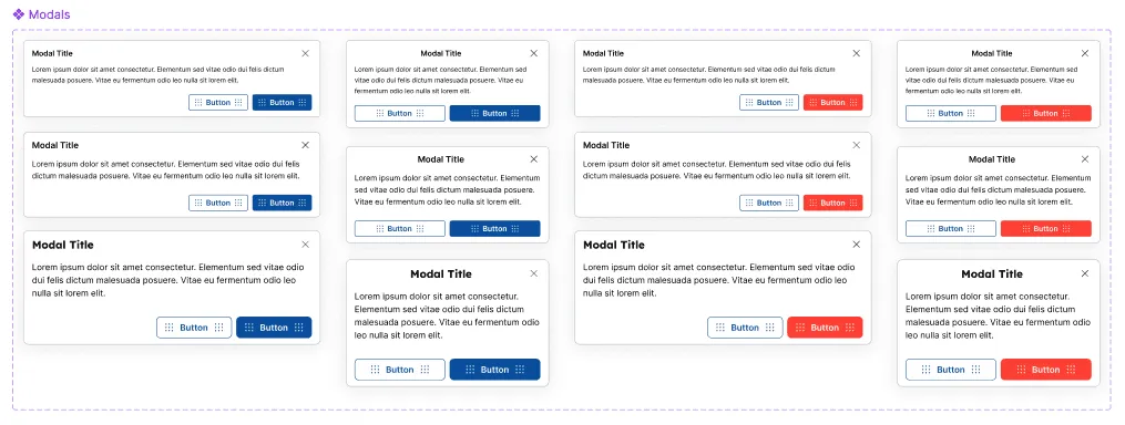
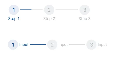
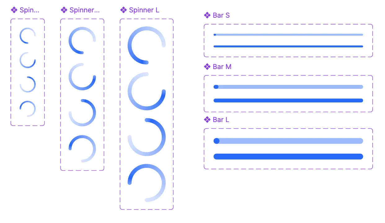
- Modals, a stepper, and loaders (spinners and progress bars).
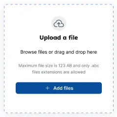
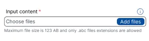
- File upload and file input.
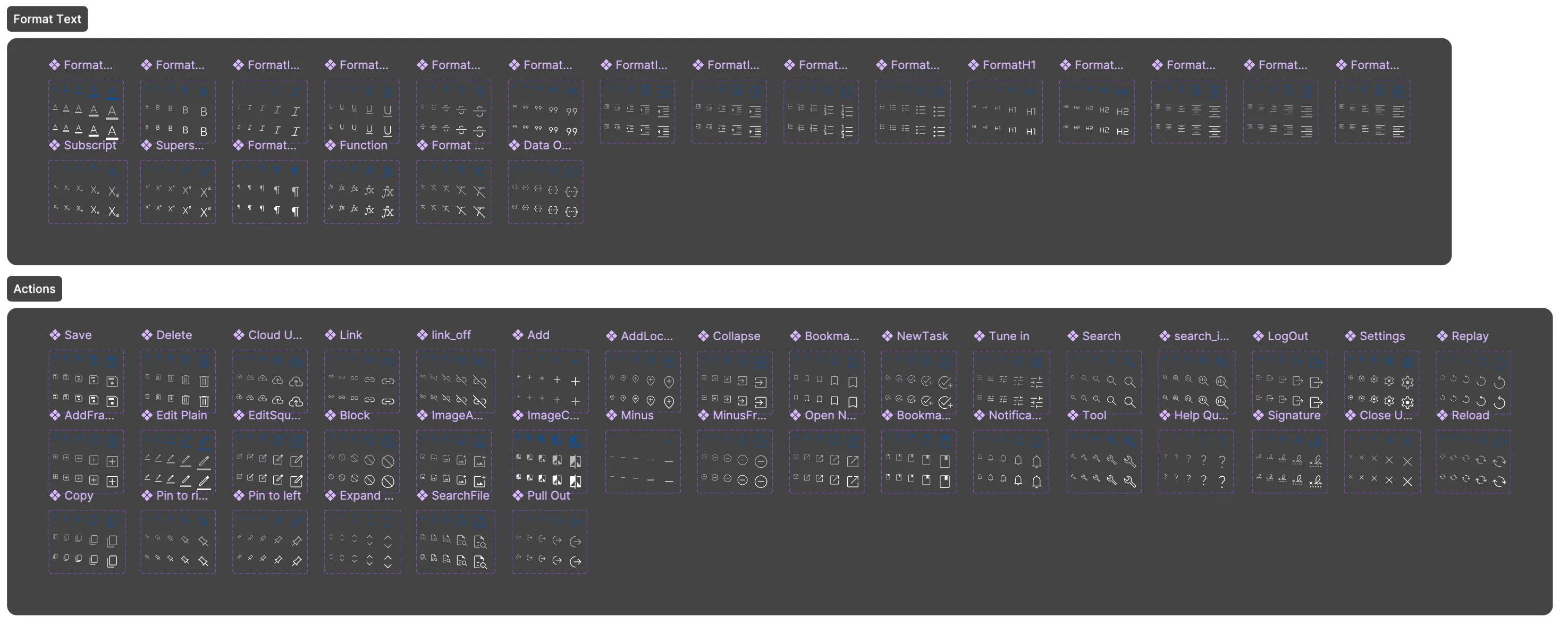
- An icon set.
Complex components, the date picker and tables, keep MUI as their functional base. I restyled them to match Crayon’s foundations.
Visual QA with front-end
I ran a review with front-end in the middle of every sprint and documented the items to iterate. At the end of the sprint we did a quicker check of only those items.
Approach
- An internal UX audit of component usage.
- A backlog ordered by how often each component appears on screen.
- Foundations and core components in Figma, with three sizes per component.
- Joint sessions with development.
- Gradual adoption, module by module.
- Visual QA every sprint.
- Versions agreed with development.
Tools and how they were used
- Figma: components with variants and states, and three sizes per component.
- MUI: the functional base for the date picker and tables, with visual adjustments to match Crayon.
Key decisions
- Its own system, not MUI as it came.
- I chose to build Crayon’s foundations and components, and to keep MUI only as the functional base for complex components (date picker, tables), restyled to match.
- I chose this over using the full MUI library, which the company already paid for.
- The reason: the app’s layout and information needs required so many customizations on top of MUI that implementing it out of the box cost more effort than owning the components.
- The cost: more initial work, and a system the team maintains itself.
- Three sizes per component, not one.
- I chose three sizes for every component over a single size.
- The reason: Connect EMR mixes data-dense screens with forms and modals, and one size could not serve all of them.
- The cost: more variants to design, build and maintain.
- Build by frequency, not by request.
- I chose a backlog set by an internal audit of how often each component appeared on screen: buttons, inputs, checkboxes and cards first. I chose this over building components as projects asked for them.
- The reason: the most-used components gave the most consistency per hour of work.
- The cost: tabs, accordions and the stepper waited, and modules that needed them kept older versions for a while.
- Say no to one-off components.
- I chose to reject requests for components that covered edge cases or very specific uses. I pointed teams to a similar Crayon component or to a composition of existing atoms. I chose this over adding every requested component.
- The reason: a component with little use adds maintenance for everyone and dilutes the system.
- The cost: some teams had to adapt their design to what the system offered.
- Visual QA in the sprint, not only Figma specs.
- I chose to review every delivery with front-end in the middle of the sprint, document what to iterate, and check only those items at the end. I chose this over trusting the Figma specs alone.
- The reason: the structure and look of each component had to match the design, and specs alone left gaps.
- The cost: design time in every sprint.
- Gradual adoption, not a big-bang migration.
- I chose to move modules to Crayon one by one over migrating the whole suite at once.
- The reason: each module needed technical adjustments and manual effort from development.
- The cost: older and newer styles live side by side while the migration goes on.
Edge cases and states
- Every input covers disabled, default, filled, hover, active, error with a message, and focus.
- Destructive actions have their own negative button variants.
- Alerts cover info, success, error and warning, each with a title, text and action.
- File upload shows size and type limits.
- Requests that are edge cases are solved with existing atoms instead of new components (decision 4).
Challenges
- Designers: some resisted, because adopting Crayon meant redesigning or translating existing screens with the new components. In general the system was well received.
- Developers: some resisted in modules where adoption meant technical adjustments to the views and manual effort. That is why Crayon is being adopted gradually (decision 6).
- Tables: my first attempt built the table fully in-house, and the development effort was too high. I cover this in What I learned.
Result and impact
- Adoption: 18 Connect EMR modules and their screens use Crayon. Source: my module inventory. They include Assessments, the Uber Health integration, Schedule, SOAP notes and Role permissions.
- Visual QA changed focus: in modules already on Crayon, a new iteration no longer needs checks of font size, border radius and other UI details. QA time goes to flows and use cases focused on the final experience. This is a change in how QA time is spent, not a measured figure.
How my experience made the difference
- I combined the designer’s view (component creator) and the product view (Product Owner) in one person.
- I started with an audit. The backlog came from data about what the system used most, not from opinions.
- I knew when to stop building. Reusing MUI for tables and saying no to one-off components kept the system small and adoptable.
- My Scrum Master certification and my earlier work with front-end developers helped me manage the change with the development teams, understand their blockers and iterate with them.
What I learned
- Build what makes you different, borrow the rest. I first tried to build the table fully in-house and the development effort was too high. Taking MUI as the functional base, with minimal visual customization, gave the same consistency at a fraction of the cost.
- Compare first, and use AI early. If I started again, I would first compare the systems already on the market that offer a middle ground between customization and implementation effort. I would lean on AI from day one to reach a practical result at a lower operating cost.
Tools
- Figma (components, variants, Auto Layout)
- MUI as the functional base for complex components